Teigro
A garlic seed monitoring app for people whose minds are on the field. If something is off, the app lets you know. If everything is fine, the silence is the answer.
- client
- Teigro, São Gotardo (MG)
- my role
- Modernize the app without forcing existing users to relearn it: I led the research with leadership and users, and the redesign, end to end.
- type
- Side project
- year
- 2024
- visual identity
- João Menezes
The interface needed to evolve without leaving behind the people who already knew how to use it
Teigro is a garlic seed monitoring app used day to day by farmers and rural workers in the São Gotardo region, in Minas Gerais, Brazil. When I started the project, the company wanted to modernize the interface. New players were entering the market and, for leadership, the product was starting to look visually outdated compared to competitors.
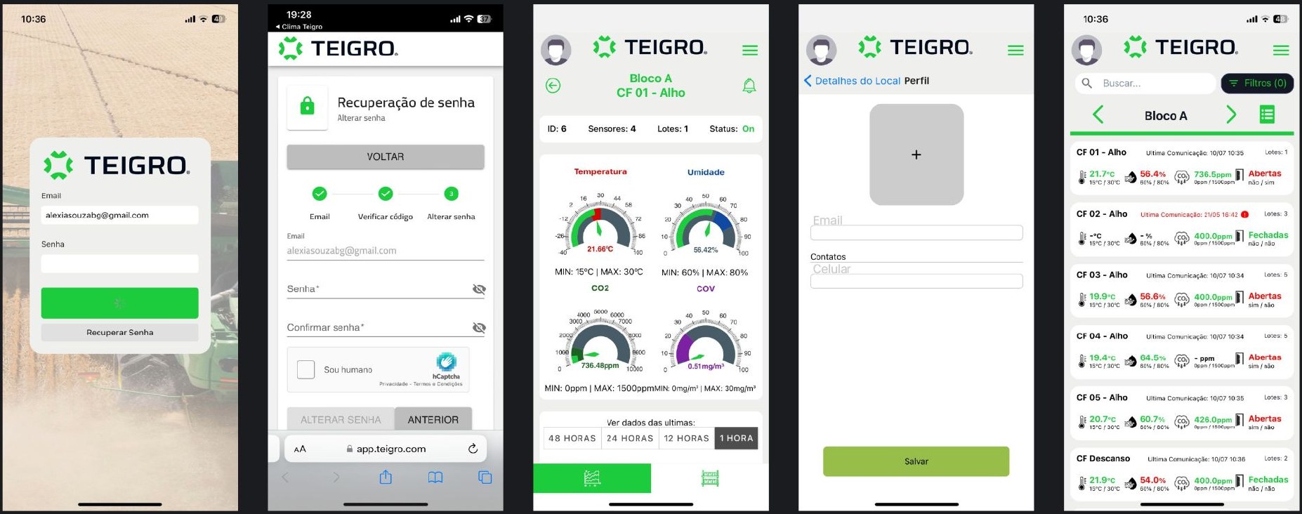
But there was another perspective that needed to be part of this decision. Many of the people using the app had little familiarity with technology and had already learned to work with that interface. Changing the structure too much could meet the company's wish to modernize, but create a new barrier for people who needed to check the product every day.
The challenge became balancing these two needs: refreshing how the product was perceived without requiring users to relearn how to use it.
The balance that guided the redesign
- New competitors
- Visually outdated interface
- Wish to modernize
- Less familiarity with technology
- Flows they already knew
- Cost of relearning
Before redesigning, I needed to understand what shouldn't change
I talked with Teigro's leadership and with people who used the app day to day. With leadership, I tried to understand what was behind the request for “modernization” and which changes mattered for how the product was perceived in the market.
With users, the focus was different: understanding how they navigated the app, what information they looked for most often and which parts of the experience were already part of their routine.
The research helped separate what needed to evolve from what needed to stay familiar.
Modernizing the visual layer without rebuilding the product's logic
Instead of redesigning the flows from scratch, I focused the changes on how the app organized, prioritized and communicated information.
The structure users already knew was kept whenever possible. The biggest change was in the visual hierarchy and in how the system communicated what needed attention.

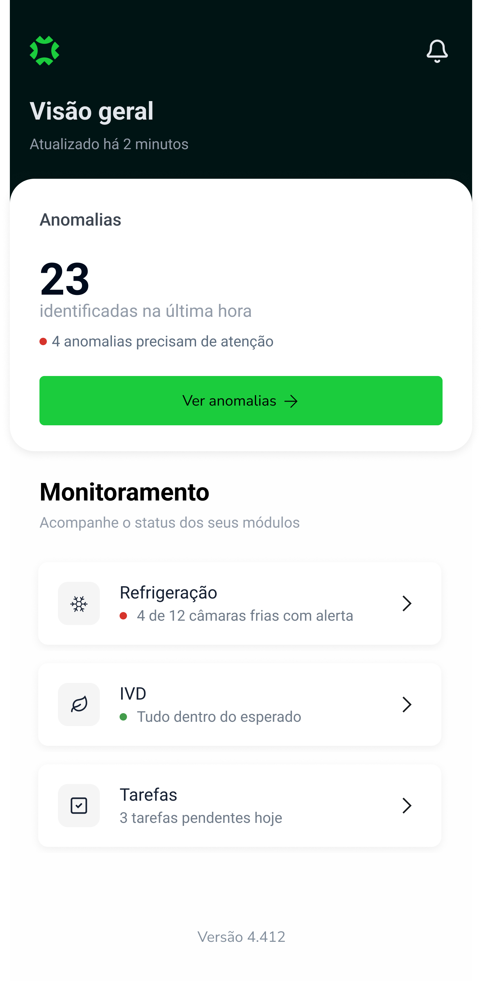
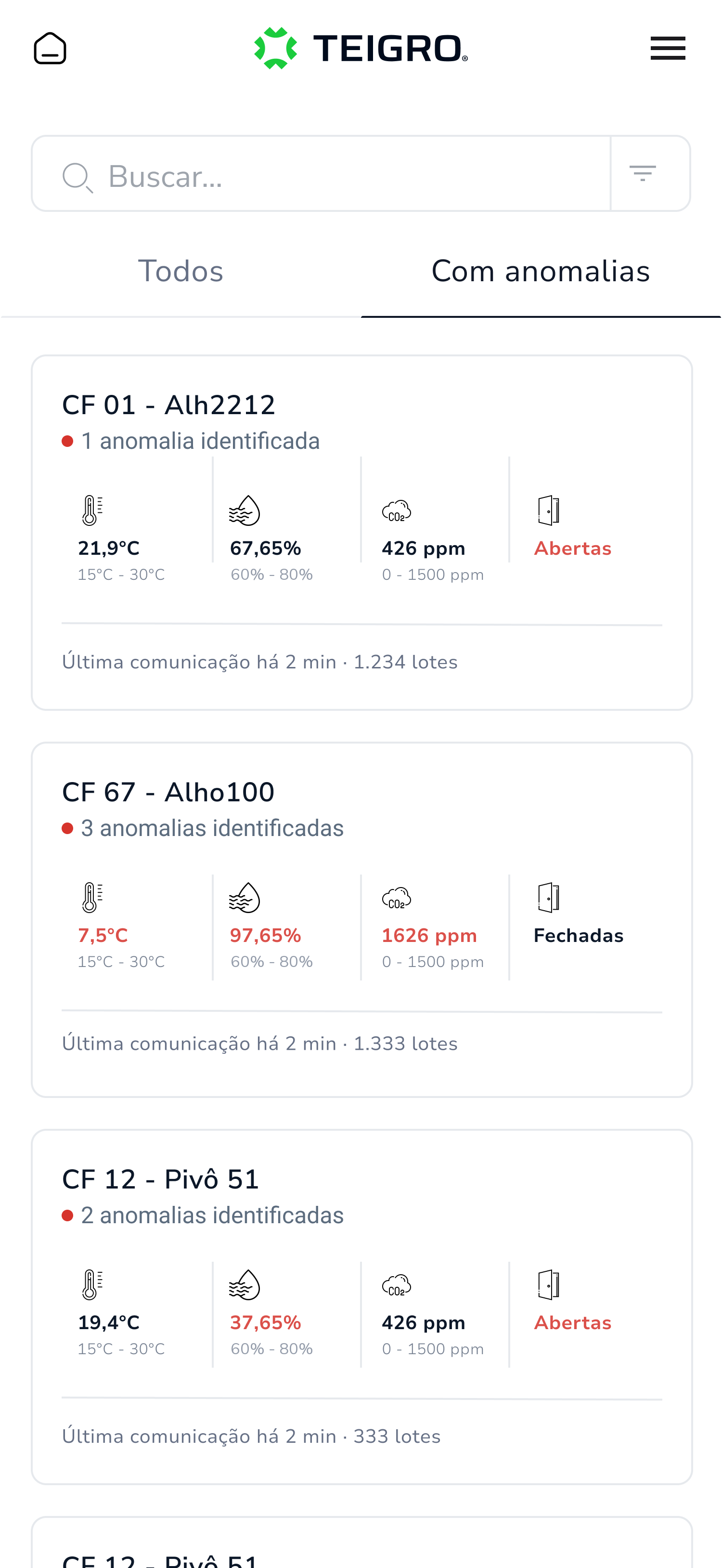
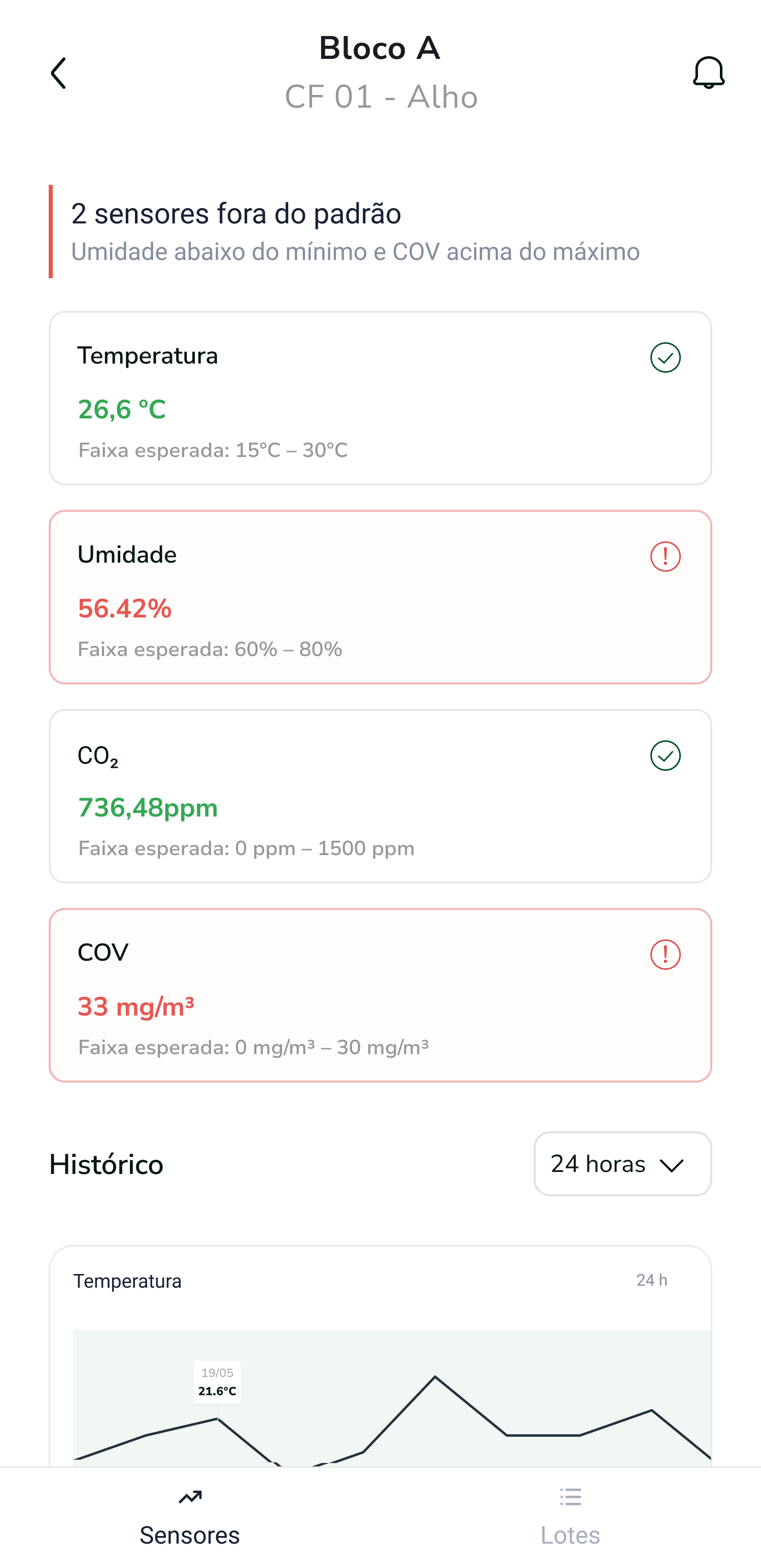
The new interface changed without requiring people to relearn the product
After launch, Teigro's feedback was that the team adapted quickly to the new version and didn't run into any significant difficulties with the change.
For the project, this feedback answered one of the redesign's main concerns: it was possible to update the experience without breaking the familiarity users had built with the previous product.